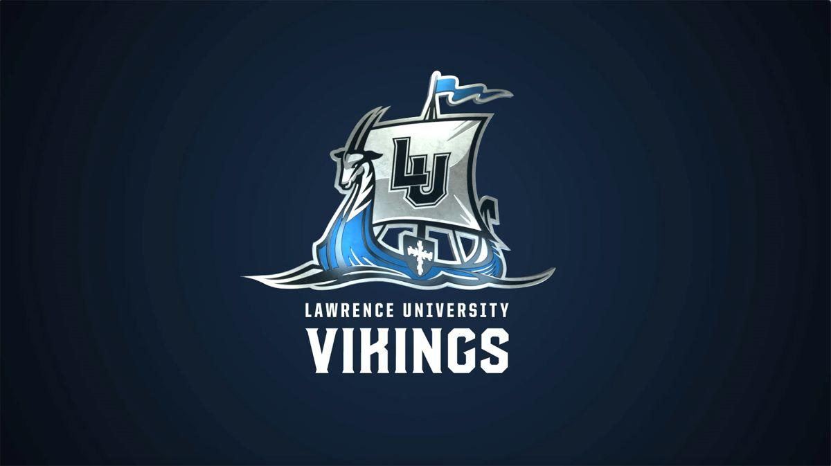
Lawrence University debuted a new athletics logo Tuesday that will gradually replace the Viking head that has been a fixture on the school’s uniforms and apparel for more than 50 years.
The new logo, featuring a Viking ship that incorporates the antelope from the crest on the Lawrence coat of arms, is an adaptation of a design that was part of the recent makeover of the basketball court in Alexander Gymnasium. The shield from the same coat of arms adorns the side of the vessel, and on the massive sail is the familiar interlocking LU.
A campus unveiling of the logo took place outside of Warch Campus Center.
Ceara Larson ’21, a softball player and biology-physics major, called it “sharp and intimidating” and said it catches the essence of Lawrence athletics.
“For me, using the Viking ship logo emphasizes the importance of teamwork and the family atmosphere we have within athletics,” she said. “I am so excited for us to start using it.”

Viking Athletics: Ready The Ship
Above: A video to celebrate the unveiling of the new logo was created with the help of Tom Coben ’12, a freelance motion graphics and visual effects artist in the Twin Cities.
The unveiling, which comes on National Student-Athlete Day and during DIII Week, is an exciting moment for Lawrence athletes, said Director of Athletics Kim Tatro. Coming as spring sports teams are again competing after a year in which the COVID-19 pandemic shut down most athletic competitions is all the sweeter.
“The rebranded logo is uniquely ours and it moves away from a Vikings logo that is used by many others,” Tatro said. “While the logo is modern and fresh, it incorporates significant pieces of our Lawrence history.”
It’s also “more inclusive and gender-neutral” than the Viking head that adorns the current logo, an important consideration in the rebrand, she said.
The new logo will appear on fan gear immediately. It will be featured on uniforms for many of the 22 Lawrence sports teams as those uniforms come up for replacement in the coming years.
“Our staff will have the option to incorporate the logo in ways they feel best suit their program needs,” Tatro said.
Football coach Tony Aker applauded the new logo, saying it will connect the entire campus, something that’s important to student-athletes and coaches.
“The ship is the perfect illustration of our great campus, and having the antelope, shield, and LU all part of the design connects every corner of our campus,” he said. “This is a logo for all who love and support LU; I believe it represents all of us.”
The design of the logo was led by Art Director Matt Schmeltzer of the Office of Communications. He worked with Fox Valley illustrator Mike Tessmer to plan out the initial design for the Alexander floor.
“We started with a handful of concepts and sketches and continued to build from there,” Schmeltzer said. “None of this would be possible without Mike’s help.”
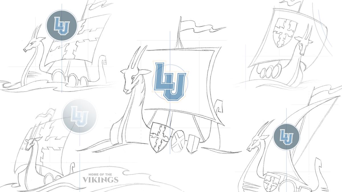
Sketches from Matt Schmeltzer and Mike Tessmer show the design process in creating the new Lawrence University logo.
It was the strong, positive reaction to the Alexander floor that led to discussions about rethinking the existing Vikings logo, which has been part of Lawrence athletics since the late 1960s. The ship design on the Alexander floor was initially meant to be a complementary design element, nothing more.
“But when the court was revealed, it seemed to really resonate with the community,” Schmeltzer said. “We received a lot of requests to use the ship graphic on apparel, merchandise, and in social media posts. That positive energy made us step back and say, ‘Maybe we have something here’.”
The new design modernizes Lawrence’s logo while still celebrating the school’s history. All that was taken into consideration during the design process, Schmeltzer said.
“By including stylized elements of the Amos Lawrence family crest and the coat of arms—the shield on the side of the ship and the antelope head on the prow—we’re left with a unique mark that nods to our institution’s history,” he said.
Women’s soccer coach Joe Sagar said he thinks pride in the new logo will extend well beyond the athletics teams, calling it a “modern and creative take” on the current logo.
“The fact that it is going to draw in our entire campus community rather than being ‘just’ an athletics logo is awesome,” he said.
D’Andre Weaver ’21, a football player and economics major, said he’s happy Lawrence will move away from a Vikings logo so closely aligned with a certain professional football team to the west.
“The new logo separates us from them and adds a separate identity to who we are,” he said. “I love how the logo is honoring the Nordic past of the Vikings and celebrating what is to come for Lawrence and Lawrence athletics.”
Aly Palmer ’99 thinks it will resonate with alumni as well. She got an early peek at the logo through her work as co-chair of the Vikings Athletics Advocacy Council.
“I love how the Viking ship innately incorporates the notion of teamwork — something that all Lawrence athletes do well,” she said. “And it was time for an update. I mean no disrespect to the old logo—the Viking head was the prominent logo during my time at LU—but as the athletics department enters a new, post-pandemic era, an updated logo seems appropriate. And the tie-in to main campus, with the coat of arms and antelope head, makes sense as well; this is a logo all Lawrence students can be proud of.”
Ed Berthiaume

Ed Berthiaume is director of public information at Lawrence University.